Skip to Main Content

How to Create a Research Poster

A guide fo creating a research poster.

What is a Research Poster?

Posters are widely used in the academic community, and most conferences include poster presentations in their program.  Research posters summarize information or research concisely and attractively to help publicize it and generate discussion. 

The poster is usually a mixture of a brief text mixed with tables, graphs, pictures, and other presentation formats. At a conference, the researcher stands by the poster display while other participants can come and view the presentation and interact with the author.
What Makes a Good Poster?

  • Important information should be readable from about 10 feet away
  • Title is short and draws interest
  • Word count of about 300 to 800 words
  • Text is clear and to the point
  • Use of bullets, numbering, and headlines make it easy to read
  • Effective use of graphics, color and fonts
  • Consistent and clean layout
  • Includes acknowledgments, your name and institutional affiliation

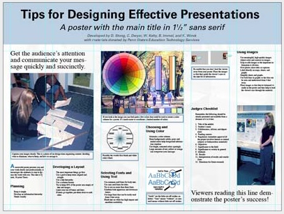
A Sample of a Well Designed Poster

View this poster example in a web browser.  

Three column blue and white poster with graphs, data, and other information displayed.

Image credit: Poster Session Tips by mousejockey@psu.edu, via Penn State

Where do I begin?

Answer these three questions:

  1. What is the most important/interesting/astounding finding from my research project?
  2. How can I visually share my research with conference attendees? Should I use charts, graphs, photos, images?
  3. What kind of information can I convey during my talk that will complement my poster?

What software can I use to make a poster?

PowerPoint

A popular, easy-to-use option. It is part of Microsoft Office package and is available on the library computers in rooms LC337 and LC336. (Advice for creating a poster with PowerPoint).

Adobe Illustrator, Photoshop, and InDesign

Feature-rich professional software that is good for posters including lots of high-resolution images, but they are more complex and expensive.  NYU Faculty, Staff, and Students can access and download the Adobe Creative Suite.
Open Source Alternatives 

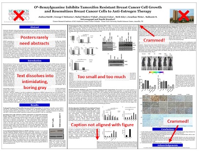
A Sample of a Poorly Designed Poster

View this bad poster example in a browser.

Poster marked up pointing out errors, of which there are many.

Image Credit: Critique by Better Posters