| Software | Mac/Windows | DS Lab | VCL | HPC | Personal Access at NYU |
|---|---|---|---|---|---|
| SPSS | Both | ✔ | ✔ |
Purchase via NYU OnTheHub or via IBM Vendors |
|
| JMP | Both | ✔ | ✔ |
Purchase via JMP |
|
| Stata | Both | ✔ | ✔ | ✔ |
Purchase Stata Student Plan |
| SAS | Windows | ✔ | ✔ | ✔ |
Purchase SAS via NYU OnTheHub Access SAS OnDemand for Academics for free |
| R | Both | ✔ | ✔ | ✔ | Free via CRAN website |
| MATLAB | Both | ✔ | ✔ | ✔ |
Free via the NYU MATLAB Portal For HPC, contact hpc@nyu.edu |
| Group | Test1 | Test2 |
| 0 | 86 | 83 |
| 0 | 93 | 79 |
| 0 | 85 | 81 |
| 0 | 83 | 80 |
| 0 | 91 | 76 |
| 1 | 94 | 79 |
| 1 | 91 | 94 |
| 1 | 83 | 84 |
| 1 | 96 | 81 |
| 1 | 95 | 75 |
| Group | Test1 | Test2 |
| 0 | 86 | 83 |
| 0 | 93 | 79 |
| 0 | 85 | 81 |
| 0 | 83 | 80 |
| 0 | 91 | 76 |
| 1 | 94 | 79 |
| 1 | 91 | 94 |
| 1 | 83 | 84 |
| 1 | 96 | 81 |
| 1 | 95 | 75 |
* First enter the data manually;
input str10 sex test1 test2
"Male" 86 83
"Male" 93 79
"Male" 85 81
"Male" 83 80
"Male" 91 76
"Female" 94 79
"Female" 91 94
"Female" 83 84
"Female" 96 81
"Female" 95 75
end
* Next run a paired t-test;
ttest test1 == test2
* Create a scatterplot;
twoway (scatter test2 test1 if sex == "Male") (scatter test2 test1 if sex == "Female"), legend (lab(1 "Male") lab(2 "Female"))
* First enter the data manually;
data example;
input sex $ test1 test2;
datalines;
M 86 83
M 93 79
M 85 81
M 83 80
M 91 76
F 94 79
F 91 94
F 83 84
F 96 81
F 95 75
;
run;
* Next run a paired t-test;
proc ttest data = example;
paired test1*test2;
run;
* Create a scatterplot;
proc sgplot data = example;
scatter y = test1 x = test2 / group = sex;
run;
# Manually enter the data into a dataframe
dataset <- data.frame(sex = c("Male", "Male", "Male", "Male", "Male", "Female", "Female", "Female", "Female", "Female"),
test1 = c(86, 93, 85, 83, 91, 94, 91, 83, 96, 95),
test2 = c(83, 79, 81, 80, 76, 79, 94, 84, 81, 75))
# Now we will run a paired t-test
t.test(dataset$test1, dataset$test2, paired = TRUE)
# Last let's simply plot these two test variables
plot(dataset$test1, dataset$test2, col = c("red","blue")[dataset$sex])
legend("topright", fill = c("blue", "red"), c("Male", "Female"))
# Making the same graph using ggplot2
install.packages('ggplot2')
library(ggplot2)
mygraph <- ggplot(data = dataset, aes(x = test1, y = test2, color = sex))
mygraph + geom_point(size = 5) + ggtitle('Test1 versus Test2 Scores')
sex = {'Male','Male', 'Male', 'Male', 'Male', 'Female', 'Female', 'Female', 'Female', 'Female'};
t1 = [86,93,85,83,91,94,91,83,96,95];
t2 = [83,79,81,80,76,79,94,84,81,75];
% paired t-test
[h,p,ci,stats] = ttest(t1,t2)
% independent samples t-test
sex = categorical(sex);
[h,p,ci,stats] = ttest2(t1(sex=='Male'),t1(sex=='Female'))
plot(t1,t2,'o')
g = sex=='Male';
plot(t1(g),t2(g),'bx'); hold on; plot(t1(~g),t2(~g),'ro')
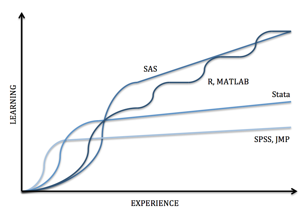
| Software | Interface* | Learning Curve | Data Manipulation | Statistical Analysis | Graphics | Specialties |
|---|---|---|---|---|---|---|
| SPSS | Menus & Syntax | Gradual | Moderate |
Moderate Scope |
Good | Custom Tables, ANOVA and Multivariate Analysis |
| JMP | Menus & Syntax | Gradual | Strong |
Moderate Scope |
Great | Design of Experiments, Quality Control, Model Fit |
| Stata | Menus & Syntax | Moderate | Strong |
Broad Scope |
Good | Panel Data, Mixed Models, Survey Data Analysis |
| SAS | Syntax | Steep | Very Strong |
Very Broad Scope |
Very Good | Large Datasets, Reporting, Password Encryption, Components for Specific Fields |
| R | Syntax | Steep | Very Strong |
Very Broad Scope |
Excellent | Graphic Packages, Machine Learning, Predictive Modeling |
| MATLAB | Syntax | Steep | Very Strong |
Limited Scope |
Excellent | Simulations, Multidimensional Data, Image and Signal Processing |
*The primary interface is bolded in the case of multiple interface types available.
